With many profiles in a region we can build a climatology and see how the water column changes over the year. We download all floats active in a box across several years and group by month.
%run _style.py
import numpy as np
import xarray as xr
import pandas as pd
import matplotlib.pyplot as plt
from argopy import DataFetcher
from _style import PALETTE

box = [-45, -30, -38, -30, 0, 2000, '2018-01-01', '2020-12-31']
ds_point = DataFetcher(src='erddap', mode='expert').region(box).to_xarray()
ds = ds_point.argo.point2profile()
print('profiles:', ds.sizes['N_PROF'], '· max levels:', ds.sizes['N_LEVELS'])
profiles: 1897 · max levels: 1006
def clean(ds):
    mode_is_R = (ds.DATA_MODE.astype(str) == 'R')
    def merge(v):
        return xr.where(mode_is_R, ds[v], ds[f'{v}_ADJUSTED'])
    def merge_qc(v):
        return xr.where(mode_is_R, ds[f'{v}_QC'], ds[f'{v}_ADJUSTED_QC'])
    def mask(var, qc):
        qc_str = qc.astype(str)
        return var.where((qc_str == '1') | (qc_str == '2'))
    return xr.Dataset({
        'TEMP': mask(merge('TEMP'), merge_qc('TEMP')),
        'PSAL': mask(merge('PSAL'), merge_qc('PSAL')),
        'PRES': mask(merge('PRES'), merge_qc('PRES')),
    }, coords={'LATITUDE': ds.LATITUDE, 'LONGITUDE': ds.LONGITUDE,
               'TIME': ds.TIME, 'CYCLE_NUMBER': ds.CYCLE_NUMBER})

dsc = clean(ds)
Interpolate to fixed levels
Each profile has its own N_LEVELS (the float samples at different pressures). To average across profiles we need to interpolate everything onto a common pressure grid.
from scipy.interpolate import interp1d

p_grid = np.arange(0, 2001, 10)

def interp_profile(values, pres):
    mask = ~np.isnan(values) & ~np.isnan(pres)
    if mask.sum() < 5:
        return np.full_like(p_grid, np.nan, dtype=float)
    p_valid, v_valid = pres[mask], values[mask]
    return interp1d(p_valid, v_valid, bounds_error=False, fill_value=np.nan)(p_grid)

n_prof = dsc.sizes['N_PROF']
temp_grid = np.empty((n_prof, len(p_grid)))
psal_grid = np.empty((n_prof, len(p_grid)))
for i in range(n_prof):
    temp_grid[i] = interp_profile(dsc.TEMP.isel(N_PROF=i).values, dsc.PRES.isel(N_PROF=i).values)
    psal_grid[i] = interp_profile(dsc.PSAL.isel(N_PROF=i).values, dsc.PRES.isel(N_PROF=i).values)

grid = xr.Dataset({
    'TEMP': (['N_PROF', 'PRES'], temp_grid),
    'PSAL': (['N_PROF', 'PRES'], psal_grid),
}, coords={'PRES': p_grid, 'TIME': dsc.TIME,
           'LATITUDE': dsc.LATITUDE, 'LONGITUDE': dsc.LONGITUDE})
gridMonthly climatology
month = grid.TIME.dt.month
grid = grid.assign_coords(month=('N_PROF', month.values))

clim_temp = grid.TEMP.groupby('month').mean(skipna=True)
clim_psal = grid.PSAL.groupby('month').mean(skipna=True)
print(clim_temp.dims, clim_temp.shape)
('month', 'PRES') (12, 201)
fig, (ax1, ax2) = plt.subplots(1, 2, figsize=(13, 7), sharey=True)

im1 = ax1.contourf(clim_temp.month, clim_temp.PRES, clim_temp.T,
                   levels=20, cmap='RdYlBu_r')
ax1.invert_yaxis()
ax1.set_xlabel('Month')
ax1.set_ylabel('Pressure (dbar)')
ax1.set_title('Climatological temperature (°C)', loc='left')
ax1.set_xticks(range(1, 13))
ax1.set_ylim(500, 0)
plt.colorbar(im1, ax=ax1, label='°C')

im2 = ax2.contourf(clim_psal.month, clim_psal.PRES, clim_psal.T,
                   levels=20, cmap='viridis')
ax2.set_xlabel('Month')
ax2.set_title('Climatological salinity (PSU)', loc='left')
ax2.set_xticks(range(1, 13))
ax2.set_ylim(500, 0)
plt.colorbar(im2, ax=ax2, label='PSU')

plt.tight_layout()
plt.show()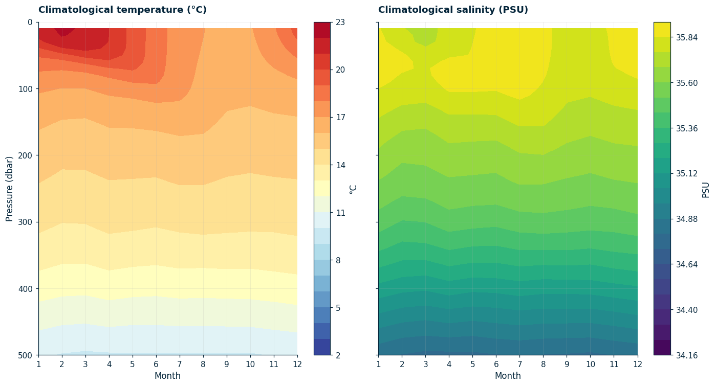
Lo que se ve clarito es la termoclina estacional: el ciclo de calentamiento en verano austral (enero a marzo) mete agua tibia hasta ~50 a 100 dbar, mientras que en invierno (julio a septiembre) la columna de mezcla baja hasta los 200 a 300 dbar y la termoclina queda más profunda.
Perfiles promedio por estación
verano = grid.where(grid.month.isin([1, 2, 3]), drop=True).mean('N_PROF', skipna=True)
invierno = grid.where(grid.month.isin([7, 8, 9]), drop=True).mean('N_PROF', skipna=True)

fig, (ax1, ax2) = plt.subplots(1, 2, figsize=(10, 8), sharey=True)
ax1.plot(verano.TEMP, verano.PRES, color=PALETTE['orange'], lw=2, label='summer (JFM)')
ax1.plot(invierno.TEMP, invierno.PRES, color=PALETTE['blue'], lw=2, label='winter (JAS)')
ax1.invert_yaxis()
ax1.set_xlabel('Temperature (°C)')
ax1.set_ylabel('Pressure (dbar)')
ax1.set_ylim(500, 0)
ax1.set_title('Seasonal profiles. Open South Atlantic (2018 a 2020)', loc='left')
ax1.legend(frameon=False)

ax2.plot(verano.PSAL, verano.PRES, color=PALETTE['orange'], lw=2, label='summer')
ax2.plot(invierno.PSAL, invierno.PRES, color=PALETTE['blue'], lw=2, label='winter')
ax2.set_xlabel('Salinity (PSU)')
ax2.set_ylim(500, 0)
ax2.set_title(' ', loc='left')
ax2.legend(frameon=False)

plt.tight_layout()
plt.show()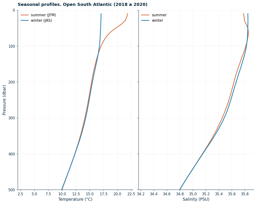
Resumen
Para climatologías hay que interpolar todos los perfiles a una grilla de presión común.
groupby('month').mean()te da la climatología mensual.En el Atlántico Sur el ciclo estacional se ve clarito en los primeros ~300 dbar.
El próximo paso natural es calcular la profundidad de la capa de mezcla (MLD) y mapearla.